This post is part of the Danielle Lazier :: SFhotlist Team Keller Williams San Francisco Real Estate Transformations series.
This two-bedroom plus guest suite/home office, and two-bathroom condo came with stunning top-floor views and one-car parking. Built in 1904, the home contained period details such as coved ceilings, bay windows, hardwood floors, and wainscoting. The goal was to highlight this vintage appeal while also taking advantage of the plentiful natural light.
Investing in staging and simple upgrades will help you secure the best return on your San Francisco real estate investment. It’s one of our main goals as the top producing Keller Williams San Francisco SFhotlist Team to tease out essential details in a home and maximize the selling appeal. It's our priority to get our clients the best return on their real estate investment, every time.
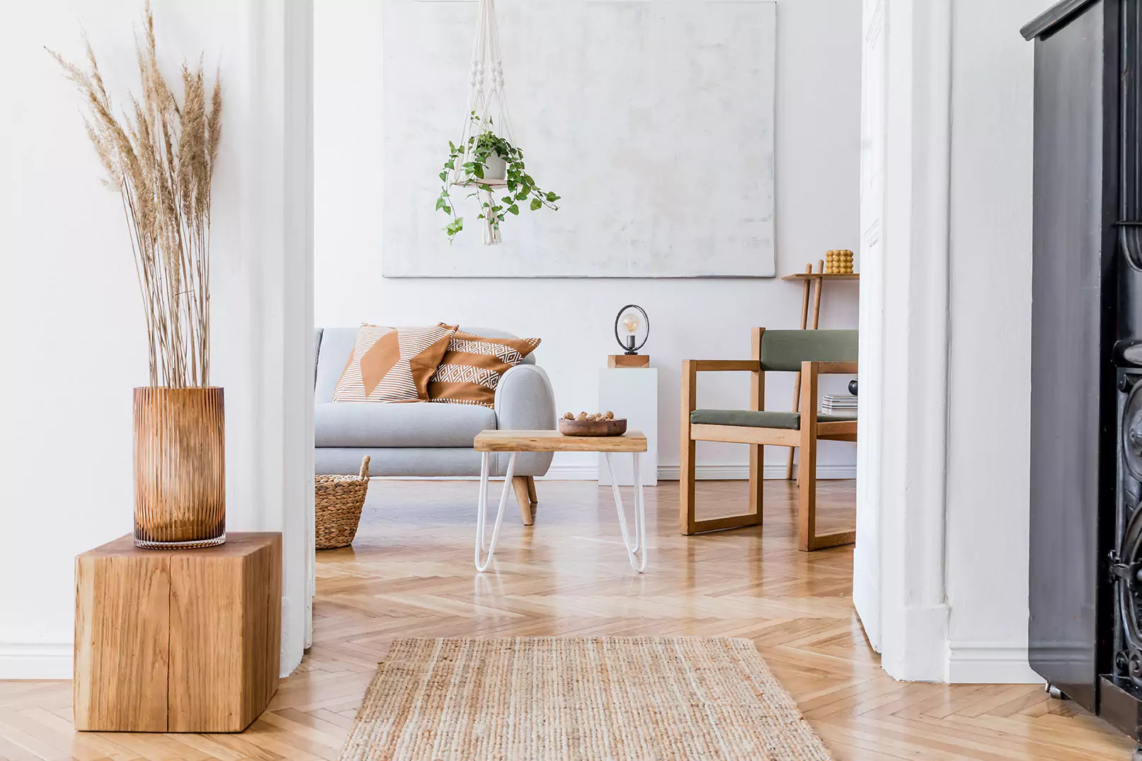
The challenge of a home replete with period details is to highlight these features while also keeping the look fresh and modern. If the wrong color palette is chosen, for example, the house can feel dark or cramped. As you'll see in the before and after photos below, we used light, airy palettes to take advantage of the natural light and softly complement the home's vintage features.
The beautiful old-fashioned charm of vintage details was easy to incorporate into a more modern style. A few accent pieces popped against the soft whites and greys of the walls and built-in cabinetry. The idea was to be bold without creating a look that was too busy.
Before:
After:
This new area rug really pulls the room together while still allowing the room to maintain an open, airy ambiance. The geometric patterns add a modern feel without compromising the vintage charm of the home's original details.
To maximize an open-concept kitchen, the goal is to accent the space with decor without creating a space that feels cluttered. Yes, even an open-concept layout can feel cluttered if decor and appliances are not staged in a way that feels organized and clean.
Before:
After:
By creating space on the kitchen counters and using soft colors, the open concept layout felt even more spacious than before.
This home's abundance of natural light was enhanced with just the right elements to brighten the bedrooms.
Before:
Fresh coats of paint, removing the heavy window coverings, and a new bedspread instantly brightened up this room and allowed it to be flooded with soft lighting.
After:
Sweeping views of Eureka Valley, Twin Peaks, Corona Heights, and Noe Valley deserved to be highlighted. Creating an inviting space on the upper deck was simple to achieve with some patio furniture and a couple of decorative throw pillows. Even little details like these can make a huge difference in leveraging the selling potential of a home.
Are you selling a home in San Francisco and looking to get the best return on your investment? Let's talk! Click here to schedule a consultation.
